
From Passion to Precision
Completion Designers
Matching the message to the mission—and the man behind it.

The conversation
Ken Reita didn't set out to start a design studio. He set out to fix a broken process.
After decades in aviation interior design, Ken Reita had seen the industry shift. Custom design wasn’t so custom anymore. Personalization was getting sidelined by production schedules and material quotas. Aircraft owners were being herded through multi-million-dollar refurbishment projects without the benefit of thoughtful design.
“They're expected to make huge design decisions on the fly,” he told me during our first call. “And by the time they figure out what they really want, it’s too late to change course.”
Ken believed there had to be a better way—one that gave owners more control over their investment and the final result.
So he flipped the model and launched Completion Designers, an independent aviation design studio with a design-first, client-centric approach, free from the pressure of production demands or outside agendas. And it worked.
Clients responded with confidence and trust. Now, Ken needed his website copy to reflect that experience— and to match the beauty of his work.

Ken needed focus, not fluff.
From the outset, it was clear how much care Ken poured into every detail of his work. So it didn't surprise me when he followed up our first call with pages of notes and "thought starters."
And because he's as much a perfectionist as I am, he didn't blink when I set them aside to focus on research first.
Candid interviews, competitive analysis, and a deep dive into his industry revealed the unique value that Completion Designers offers its clients—freedom and control.
The freedom to explore design with expert guidance— without the pressure of outside agendas and schedules. To take their custom design specs to multiple completion centers for apples-to-apples quotes. The kind of freedom that puts Completion Designers' clients back in control.
And for ultra-high-net-worth clients accustomed to calling the shots—that's everything.
The work
The resulting key messages and brand voice reflect that promise of freedom and control—empowering the client to explore all of their options without having to go it alone. The final copy is calm, precise, and quietly assured—just like Ken.
- Industry, customer, and competitive research.
- Messaging
- Brand voice
- Full website copy
Additional Work
- Launch story
- Case studies
- Email campaign
- Editorial

From website copy to brand voice clarity.
Springer Publishing Company
Part one: A Plan to Pass—and a Reason to Believe.
(The Exam Prep Division)
The conversation
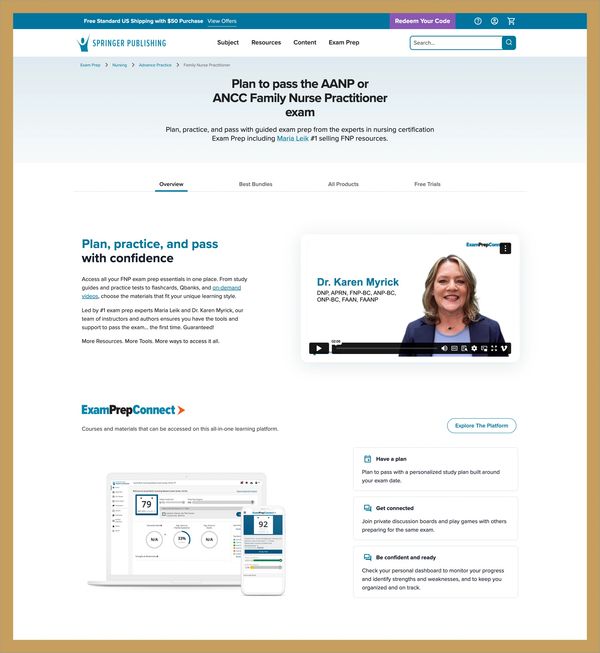
When I first spoke with Justin Mayhew of Springer Publishing, the Exam Prep division was his focus. They were redesigning the microsite, tightening their product lineup, and looking for better ways to connect with high-stakes test takers.
What they didn't yet have was a clear, cohesive voice. Or a message strong enough to rise above the noise in a crowded and sometimes chaotic exam prep space.
Their internal team knew what was missing. And they were ready to fix it.
What began as a request for "better website copy" quickly revealed messaging written from the company's point of view, inconsistent tone across product pages, and little emotional connection to the people who actually needed their tools—anxious nurses and social workers, most of them studying for high-stakes licensure exams while working full-time in their field.

Listen first, write later.
I started where I always do—with research. First, the company and its existing content, then competitors, and finally, customers:
- End users (nurses and social workers preparing for high-stakes licensing and certification exams).
- Educators who incorporate exam prep into their curricula.
- Authors whose names and voices shape the exam prep books, courses, and materials in Springer's catalog.
What emerged was a remarkably clear emotional throughline: More than time, price, and access—fear, overwhelm, and doubt were the real barriers for their customers.
High-stakes test-takers cried out for a plan to succeed. A clear path to passing their exam. A guide they could trust.

Brand built on trust, not tropes.
The brand voice that followed aligned with the Mentor archetype, a member of the Sage family—reassuring, empowering, and generous with its knowledge.
I then developed a messaging framework guided by a simple, powerful tagline: Plan to pass.
From there, I built a flexible messaging system anchored in emotional truths:
- "Ready to study. Ready to pass."
- "Start smart. End successfully."
- "Know that you're ready."

The work
I delivered a comprehensive brand voice guide, messaging framework, and page-by-page content recommendations, along with before-and-after examples of the voice and messaging in action, and the findings and recommendations from my research.
The best part? They used it. Springer's team didn't let the strategy sit in a folder. They applied it.
You can see the results for yourself on the Springer Exam Prep site. The headlines, product pages, and social media ads are rooted in the voice and messaging we created together.
- Website flyover and content audit
- Stakeholder interviews
- Social listening
- Internal data review
- Competitive audit
- Brand voice
- Positioning
- Messaging
- Web copy
Additional Work
- Product descriptions
- Parent brand engagement (See below)

Giving voice to a brand that moves people forward.
Springer Publishing Company
Part two: One Brand. One Voice. One Clear Way Forward.
(The Parent Brand Engagement)

The Conversation
Most brand strategy projects begin at the top—with the parent brand—and filter down. This one took the opposite path. But after seeing the success of the Exam Prep strategy, Springer Publishing came back with a bigger ask:
Could we collaborate again to define the voice and messaging for the entire company?
They didn't want a rebrand. They wanted a realignment—a way to tell one cohesive story across textbooks, exam prep, instructor resources, and digital platforms.
A story that honored their legacy as a trusted publisher but also reflected their transformation into a digital-first, deeply responsive education company.

The power of doing the work
With a strong foundation already in place, I expanded my research: More stakeholder interviews, a broader competitive audit, and a full-day virtual brand workshop with cross-functional teams from sales, content, marketing, and executive leadership.
The most powerful moments came — not from what I presented — but from what Springer Publishing's people uncovered about themselves. Brand pillars crystallized, along with a unified positioning statement, and forward-thinking messaging.
In exercise after exercise, a clear personality emerged: not flashy, not boastful, but wise, approachable, and deeply committed to helping others succeed.
While the Exam Prep brand embodied the Mentor archetype (from the Sage family), the parent brand stepped fully into the fundamental role of the Sage—a calm, knowledgeable guide with practical wisdom and deep subject matter expertise.
The Sage comes into focus
I refined their voice traits into an easy-to-remember S.M.A.R.T. acronym that now informs everything from web copy to internal communications:
- Supportive
- Modern
- Active
- Recognizable
- Trustworthy
I then developed key messages and content examples—and documented it all in a robust guide for the parent brand.
Teams across departments now speak with one voice—and that voice feels like Springer Publishing.

Not just adopted. Embodied.
Springer Publishing did something most companies never quite manage: they implemented the strategy. They did the work, trusted the process, and rallied their teams to bring it to life.
We began with a virtual brand voice launch for their sales and marketing teams, followed by a presentation to the entire company, led by Justin and his team.
Today, their verbal brand lives, not just in marketing materials, but in how they show up in the world—for educators, for students, and each other.

Yoked together by love and fresh food.
Yoke Social Table
Finding a fresh voice in a crowded marketplace

The conversation
When I first spoke with Anthony, he and his partners were up to their elbows in the business of opening a new restaurant. They were looking for a copywriter to collaborate with their web design agency on a new website.
The restaurant was taking off. Locals were falling in love with Yoke's adventurously fresh take on comfort food. And the trio of owners' passion for serving the community's "food and non-food needs" was already turning heads.
But customers can be fickle, and Yoke would be competing for attention with powerhouse brands like Chipotle, Panda Express, and Panera. They needed to capitalize on the community's affection, "Like, now."
Their timeline was tight. The website was already underway. And the brand guidelines—delivered by a previous agency without the benefit of research—were visually polished but strategically thin. They had a slogan for their positioning statement and a cliché for a tagline.
And the brand voice? We'd need to find that in a hurry.
"Good food, prepared with love and shared with others, has the power to lighten people's burdens."
From the outset, the name YOKE created confusion (for customers and search engines). Was it a misspelling? A twist on breakfast? The former agency had chosen the name but offered no rationale.
To the owners, it felt more like a cool-looking word than a clear idea.
With national competitors offering highly recognizable brands and clear messaging, Yoke couldn't afford to be vague.
Instead of glossing over the name, we met it head-on.
- The shared work of the three owners.
- Their love of their community.
- Their vision of a place where locals could gather, take a load off and enjoy a meal together.
You see where this is going.
"A yoke connects. It makes light work of heavy things by sharing the load."
That single line reframed the entire brand story and gave "Yoke" meaning in the minds and hearts of employees and customers.
A voice that winks, not whispers.
Through interviews with the owners and employees, Fly on the Wall research, extensive social listening, and a competitive audit, a brand archetype and positioning emerged. Yoke wouldn’t win by being faster, cheaper, or more familiar. It would win by being more desirable.
We leaned fully into the Lover archetype—not the soft, romantic kind, but the flirty, playful type who invites affection and awakens the senses. A perfect match to the romantic reds, pinks, and gold of their visual brand and the luscious colors and flavors of their food.
"The Lover revels in the joy and delight of the sensory and sensual experience. This archetype is motivated to attract, give, receive, and nurture. Strengthened by great passion and devotion, the Lover fosters bliss and unity, possessing an unbridled appreciation and affection for beauty, closeness, and collaboration."
From home page headlines to menu descriptions and social media posts, the passionate, adjective-rich copy is playful, inviting, and appetite-driven.

The Work
- Stakeholder interviews
- Fly-on-the wall
- Social listening
- Competitive audit
- Brand story
- Brand voice
- Full website copy